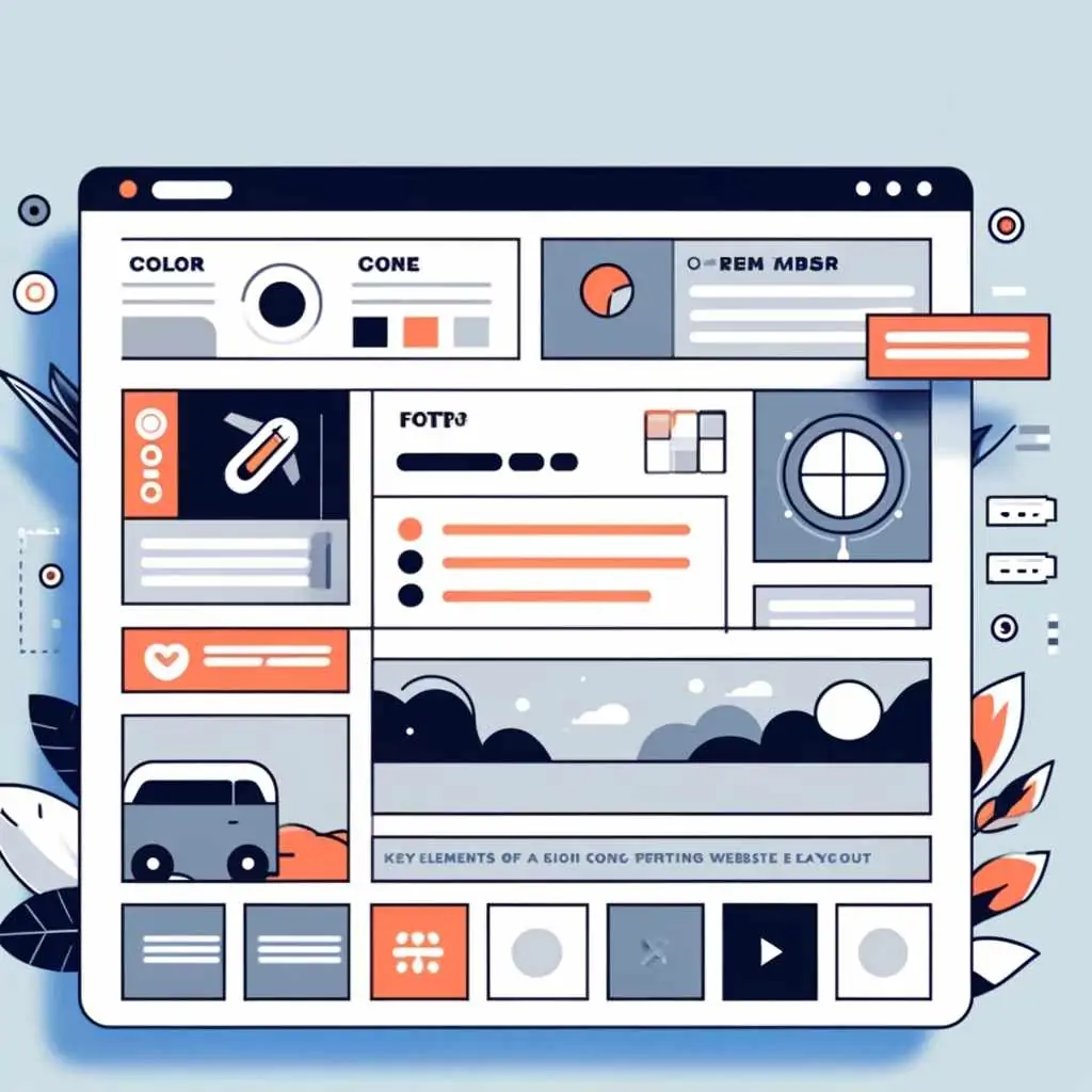
Website layout: templates, examples and best practices
Summary (TL;DR)
The text highlights the importance of a well-designed website layout, emphasizing that it not only improves appearance, but also usability and user experience.
It points out that a poorly organized layout can lead users to abandon the site quickly. It includes data from a Google study showing that 53% of users abandon sites that are slow to load.
The text offers several good practices for creating an effective layout, such as the proper choice of colors and fonts, use of spacing, inclusion of contact buttons and search tools, and highlights the importance of responsive design.
It also mentions different types of layouts (F-shaped, zigzag, minimalist, etc.) and how each can be used according to the needs of the site.
Finally, it addresses the costs involved in creating a website layout and concludes with a call to action, encouraging readers to seek out specialized services to improve their company's online presence.
Whether you're a business owner, a service provider or have an e-commerce business, one thing you can't neglect is the website layout. This structure is not only important for the appearance itself, but it directly interferes with usability and user experience.
Think of it like a standard user: if your website layout is not well organized, legible or conducive to reading information, they will most likely simply close the tab and leave your site.
A study carried out by Google itself revealed that 53% of users abandon a site that takes too long to load. Layouts that take more than three seconds can directly affect visibility and conversion, and result in a negative impact at the end of the month.
With this in mind, we've come up with some good practices for creating a modern website layout, with design responsive that will convince people to stay on your site.
What is layout?
Website layout is the visual presentation that the user has when accessing any platform in the digital world. Everything you see, from the aesthetics to the structure of the content and even how the information is organized, is part of a professional website layout.
Creating a website layout also covers usability, which refers to how easy it is for the user to navigate the site and find what they are looking for. When a website has a well-organized layout, users have a much better experience and can quickly locate the information or products they are looking for.
Website layout elements that convert
A website layout that converts needs to have some well-placed elements that are consistent with your brand. Some of these elements are
Colors, fonts and logos
Establishing a visual identity is one of the first steps in the website creation process.
Generally, the choice is always for fonts that are easy for the user to read. It's also important to prioritize fonts that are already widely used on various websites. They have already passed sieves such as web accessibility, The fonts are safe, i.e. they are unlikely to be read by the operating systems of the devices and are conducive to reading.
One option to consider is Google Fonts, In addition to being free, the database is maintained by Google itself. You can select the font according to a number of characteristics, such as serif fonts, sans serif fonts, colored fonts and even see which ones are trending. Some examples are Poppins, Montserrat, Roboto and Open Sans.
If you choose serif fonts, the Playfair Display, Merriweather, Lora, PT Serif and Noto Serif options are good. readability and fast charging.
When choosing, we recommend using 3 to 4 font families for each project. This strategy aims not only to prevent the site from taking too long to load, but also to make it more comfortable for the reader and user.
The choice of colors should also be considered: the recommendation is to avoid using very vibrant or contrasting colors, as they can tire the user's eyes and also interfere with the loading of the entire structure.
All these decisions are important in order to highlight the visual hierarchy of textual elements or give greater emphasis to buttons, such as CTA buttons, for example.
Spacing of elements
Proper spacing between layout elements is essential to ensure design harmony. It is the spacing that allows the text to be easy to read, the content to be well organized and users to be able to find information quickly on your page.
One of the recommendations is to use white space between the various elements of the site layout, such as texts, images and buttons. This space gives the user a breather and makes scanning information more pleasant and intuitive.
Search tool
Most websites have a search tool in the header, which can be useful for users to find specific information or topics on your site. This feature can be interesting in institutional website or with lots of content and pages, as it makes navigation easier and helps visitors find what they're looking for quickly.
On smaller sites, where the navigation is clear and the menus are well organized, the search tool may not be so necessary. It is important to evaluate the insertion of this tool on your site, to ensure that it brings real benefits to users.
Contact button in the top right corner
Usually identified with the word “contact”, it can have the same visual style as the site's main navigation or be highlighted in a different color, making it more visible.
Other points to consider when using CTA buttons are:
- Positioning the buttons in prominent places: they can be placed either in the first fold of the site or along the page, in strategic positions to encourage clicks;
- Clear and direct texts: the buttons must be clear and precise so that the user performs the expected action. Use short action phrases, such as “Buy, Register” and Request a quote”;
- Visual contrast: the button must be eye-catching and inviting enough to make the user click on it. Always try to make it stand out.
Main navigation
The vast majority of websites have a horizontal navigation bar in the header. When a website is accessed from a cell phone, this bar turns into an icon, called a “hamburger”, which are those three lines that indicate the menu.
In website layout, the main navigation plays the role of organizing categories and saves space across the width of the page, leaving more room for the main content. This style is already expected by many users, which makes navigation more intuitive and easier to use.
Drop-down menus
The main function of drop-down menus is to make navigation easier for the visitor, allowing them to access any page directly, saving clicks. They also work for all types of users: the visitor has a quick shortcut, while the marketer can segment categories and information.
Another option for those who want a modern website layout is the megamenu. In this model, you can add images related to each category in the submenu. It's an easily accessible option for your customers to get to know your products, and in some cases, even see some prices.
If your site has several collections, categories, megamenu with related images is one of the options that also allows you to add links and edit them in the menu, as well as highlight products, which can increase the chances of conversion.
Other elements that can be included in the website layout
It's important to understand that each website layout meets a specific need, and all elements should be discussed in advance to maximize conversions.
Although there are some design conventions, such as the positioning of the logo, the main navigation and the location of the header, there are no rigid standards for creating website layouts.
With this in mind, it is also possible to add it to the layout of a professional website:
- Slide shows and carousels, which are multiple images that make it easier to view certain information in sequence;
- Short videos on the homepage, which can capture visitors' attention and communicate the main message quickly and concisely;
- Social proof or testimonials, which highlight the quality of the services or products offered. Customer reviews and ratings tend to increase the credibility and trust of new and potential customers.
To create a website layout, it's important to discuss the needs of your business and your target audience. Every detail must be planned to ensure that the site not only attracts visitors, but also has a positive impact. responsive design and that it converts.
Responsive design

Another important point about website layout is responsive design. This practice ensures that the site as a whole adapts to different devices and screen sizes. Through responsive design it is possible to make the site easy to use and read anywhere, whether on a computer, tablet or cell phone.
For example responsive website can automatically adjust the size of images and the layout of text to fit the screen of the device being used.
This adaptability is important so that people can access the internet in a variety of ways, and a responsive website design ensures that everyone has a good experience, no matter where they are accessing the site.
How to improve site navigation?
Improving the navigation of a website means making it easier for people to find what they are looking for.
This usually involves using simple, clear language and having clearly visible links to the most important pages on the site.
In addition, a good website layout includes the use of white space, color changes (always within the defined palette) and other design elements to clearly separate the different sections of the site.
This not only makes the site easier to read, but also more visually pleasing on any device, such as cell phones or computers.
A study conducted by Adobe pointed out that the clear layout of elements and easy navigation increased the conversion rate by 30%, meaning that users either signed up to receive news or made purchases.
Other practices aimed at improving site navigation are:
- Top menu: the top menu is the main navigation bar, located at the top of every page on the site. It usually includes the site logo and the main navigation options, facilitating user access. This menu should appear on every page of the site;
- Footer menu: located at the bottom of the page, it includes links to the most important pages on the site. This helps visitors navigate easily and improves SEO, creating relevant links throughout the site;
- Sidebar: a vertical menu located on the left or right of a page. Although less common than the top menu, it is used on many websites in conjunction with the top menu to facilitate navigation;
- Visibility of information: ensure that navigation is visible and easy to access on all pages of the site;
- Clarity: the user must understand what will happen after clicking on a link or button before carrying out the action.
When creating a website layout, you need to take into account the needs and expectations of your users.
For example, on a news site, it is common to have several categories and subcategories, so that readers can easily find the types of content they are looking for.
The impact of colors on website layout
Having a color scheme in a website layout is essential. This is because through color you can make the whole site more attractive and easier to navigate, especially on the home page, which is the first impression your visitors will have.
It's the colors that help with brand recognition.
A color palette designed with the brand's ideals in mind creates a strong visual identity, making it easy for users to identify with, as well as conveying the desired tone and personality.
For example, more vibrant colors can convey a sense of energy and innovation, while softer colors tend to convey calm and confidence.
These decisions also make the website layout design process easier, because you can choose a color to draw attention to important elements, such as call-to-action buttons, menus, headers and footers.
With a well-defined color scheme, you can significantly improve the user experience and your website engagement, This will help with future conversions.
Types of layout for websites
So that your potential customers engage with your content and stay on your site, we recommend 12 types of website layout that are widely used.
Zigzag layout

A zigzag layout we did for our client Gioia.
This type of layout has a pattern that directs the user's gaze diagonally across the screen. It's a way of organizing information on sites that have a lot of graphic material.
One of the advantages of this type of website layout is the ability to divide long pages into smaller sections, i.e. the user can identify where a section begins and where it ends. An example of this type of layout is BBC News.
Site layout in F
One of the most common patterns, the F layout is an option for sites that work with a high volume of text, such as news sites, blogs and online stores.
This style also keeps users engaged, because the most important information is in the main areas of the page.
Information such as “Breaking News” are placed in the top corner of the page, which is where users tend to look first.
As users scroll down the page, their attention continues to shift to the left-hand side. A good example of this type of layout is the Globo.com.
Full-screen photo layout

Layout we did for our client Phocesi
Some companies adopt a more minimalist design, keeping a high-resolution image on the home screen.
With this type of layout, you can highlight and emphasize products. Always remember to use your own image or royalty-free image (copyright).
Sites such as Apple, Lifestyle or photography portfolios tend to use this structure.
Grid layout
The elements are, as the name suggests, distributed in a grid, which can be fixed or variable.
This system allows the grid pattern to be adjusted according to the height and width of the elements, as well as being very accessible on various types of devices, such as desktops, tablets and smartphones.
An example of this type of structure is the Pinterest.
Featured image
This type of layout is one of the most eye-catching for users and customers. Very bold, it is often used in online stores and e-commerces.
The image serves as a focal point and attracts the user's eye. An example of this type is Vòila Cosmetics, which was a website developed by UpSites.
Asymmetrical layout

Layout we did for our client Veris
The layout of the content is not organized in a uniform way, which draws the user's attention to the various sections of the page.
It is possible to highlight certain elements, depending on the needs of the project.
The Colossal is an example of how to work asymmetry into the layout.
Layout using boxes

Layout we made for our client MFit
Dynamic and structured, this type of layout has several boxes, which can differ in size or maintain uniformity between these elements.
For those who want to create a portfolio, it's an option that's often used by them. types of websites. See the layout of the elements on the Behance.
Card layout
This type of layout prioritizes one element at a time.
It's a common choice for sites with a lot of information or that want to prioritize visuals.
O Instagram is an example of this style.
Split-screen layout
The screen is divided into several parts, each of which displays one type of content. It is a model used for sites that have a lot of information.
Magazine
As the name suggests, the layout is very similar to a typical magazine design. It is a site structure widely used by personal and lifestyle blogs.
Minimalist layout

Layout we did for client Zulu
Minimalist layout is a design that places great importance on white space, text and colors in order to optimize the elements available.
It is very focused on typography, negative space and a lean color palette, which creates a sense of calm and simplicity.
This helps visitors focus on the most important content without unnecessary distractions.
Famous examples of this type of design are the Apple and Dropbox websites.
Layout of a page
In this type of layout, users can navigate between the various sections simply by scrolling down the page or clicking on links that take them to specific pages.
It's an ideal style for sites with a simpler structure and more organized content. An example is Apple's product pages.
How much does a layout cost?
And now the most important question: how much does a website layout cost? As you can see, there are several factors to consider when budgeting for this type of service.
In order to correctly align your company's needs and ensure that the website layout meets your expectations, it is necessary to understand that the process includes:
- Complexity of the project: simpler websites have more basic functionalities and tend to cost less than complex sites with multiple pages and advanced functionalities;
- Specific functionalities: e-commerce sites have demands such as carts, checkout and payment pages, for example. These functions increase the cost of the website layout;
- SEO, website optimization and responsiveness: sites that want to rank need to include good SEO practices, as well as optimizing the performance and responsiveness of the entire structure. All these points are important for the visibility and efficiency of the site;
- Maintenance and support: some costs may be recurring to ensure that the site remains up-to-date, functional and secure.
Visit our article to find out how much a website costs. and understand the whole process.
Conclusion
Having a well-structured layout for your site guarantees a good user experience, making navigation easier and increasing the chances of conversion.
An efficient layout not only reflects your brand's visual identity, but also organizes content in a clear and accessible way, contributing to visitor retention.
Factors such as usability, loading time, responsiveness and the balanced use of elements such as colors, typography and spacing must be considered in the design and be aligned with the brand.
Every detail must be planned so that the site not only attracts visitors, but also converts and offers a good experience.
If you want to transform your company's online presence with a professional and optimized website layout, count on our experts.
We offer customized services to meet the specific needs of your business, ensuring that the design is responsive, the navigation intuitive and the visual identity coherent with your brand.
Turn your website into a powerful business tool. Discover our specialized website creation services and see how we can boost your digital presence. Click here and ask for a quote from someone who makes over 150 websites a year!

Frequently Asked Questions
Why is a well-designed website layout important?
A well-designed website layout improves not only the appearance of the site, but also usability and the user experience. An organized and attractive layout helps keep visitors on the site, makes navigation easier and can increase conversions. Studies show that 53% of users abandon websites that are slow to load, so an efficient layout is crucial to online success.
What are some good practices for creating an effective website layout?
Some good practices for creating an effective layout include choosing colors and fonts appropriately, using spacing to organize content, including contact buttons and search tools, and implementing responsive design. These elements help to improve readability, navigation and the overall user experience on the site.
What are the different types of website layouts and their applications?
There are several types of website layouts, each with its own specific applications, such as the F layout for sites with lots of text, the zigzag layout for graphic materials, grid layouts for portfolios, and minimalist layouts that focus on simplicity and clarity. The choice of layout depends on the needs of the site and the target audience.
How much does it cost to create a website layout and what factors influence the cost?
The cost of creating a website layout varies depending on the complexity of the project, the specific functionalities required (such as e-commerce or SEO), optimization for mobile devices and the need for ongoing maintenance and support. Simpler sites tend to cost less, while more complex projects with multiple pages and advanced functionalities are more expensive.
Lucas Pelisari
Lucas Pelisari has been an SEO and content specialist at UpSites for over 6 years, working on the creation and optimization of digital strategies focused on lead generation and organic growth.With experience in website development projects, on-page SEO and link building, he works directly on structuring content and pages aimed at positioning on Google and acquiring qualified traffic.Throughout his career, he has worked on projects for companies such as Kommo, Aldanth, Physical Care, In4, Design.com, Adaptive, Clipto and YeSim, as well as several other clients served by UpSites.He works on projects in different niches, including technology, SaaS, services and local businesses, with a focus on performance, conversion and scalability.Her work is directly linked to lead growth and increased organic visibility, with projects that have seen consistent traffic gains after implementing SEO and content strategies.His content covers topics such as professional website creation, SEO, page structure, performance, user experience and digital growth strategies, always with a practical approach based on real market scenarios.Professional networks:LinkedIn: https://www.linkedin.com/in/lucas-widmar-pelisari-78920033/Instagram: https://instagram.com/lucaswidmar
See all posts


 Calculate Price Now
